


Creative Direction
Hawkridge approached Yondr Studio to develop a visual identity for their private estate in upstate New York. Themes of family, legacy, exploration, and serenity were important to Hawkridge so we worked together to develop an identity that embodied these ideas while also tying them back to the natural beauty surrounding the estate.︎︎︎

Logos
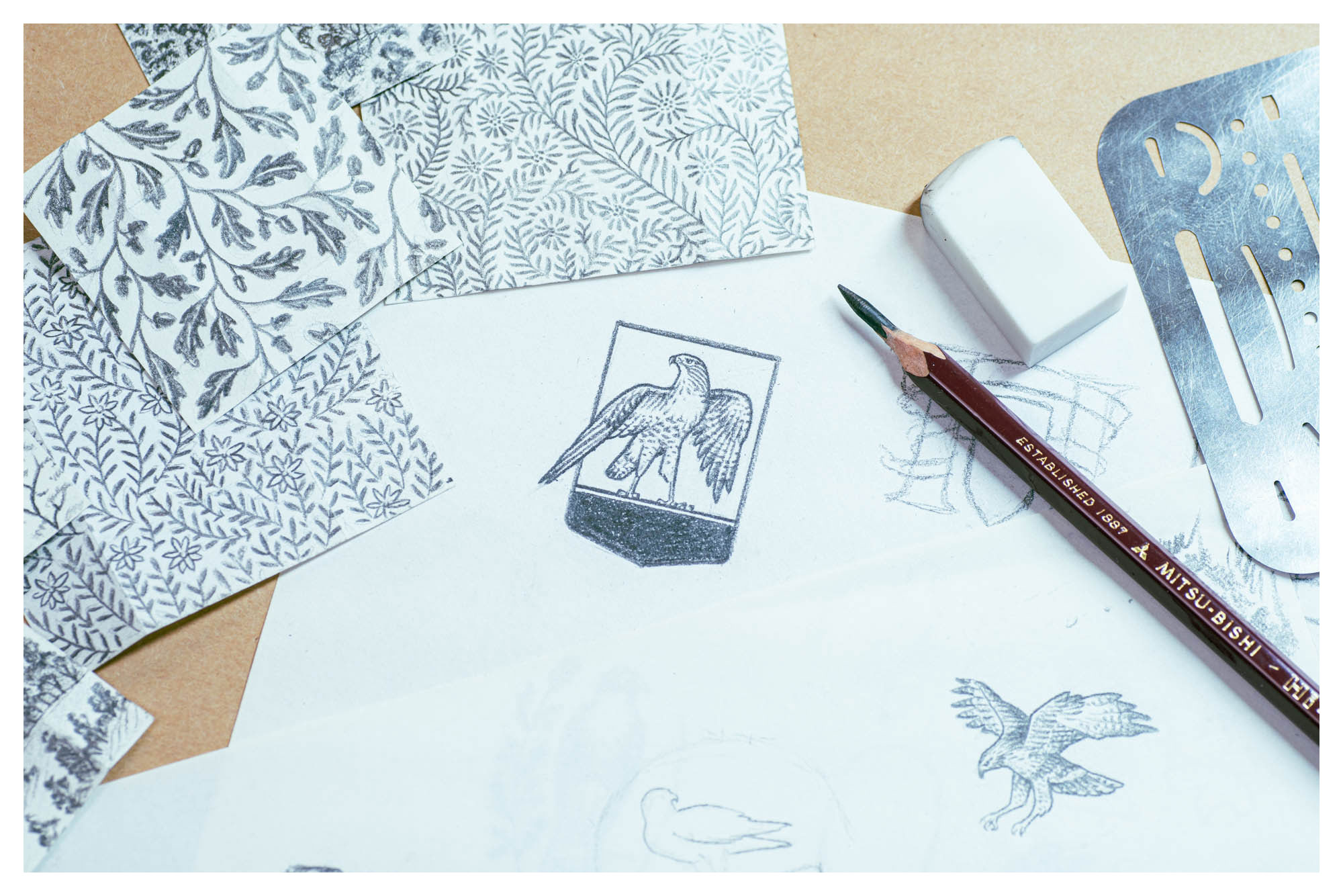
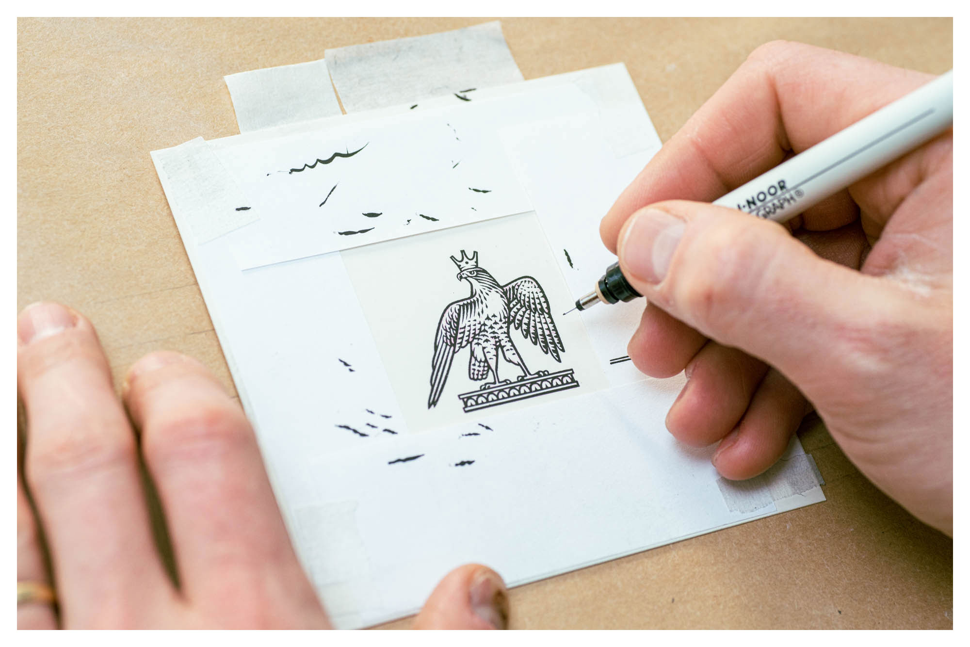
Family and legacy being the key anchors of the Hawkridge identity, we developed a logo mark and corresponding wordmark that paid homage to heraldic tradition while also introducing modern characteristics through asymmetry and type design.︎︎︎
Wordmark
For the wordmark, we applied subtle modifications to Pangram Pangram Foundry‘s beautiful mid-serif, PP Fragment. These adjustments helped to adapt the font to the personality of the brand while also introducing qualities that set it apart as a unique wordmark.
For the wordmark, we applied subtle modifications to Pangram Pangram Foundry‘s beautiful mid-serif, PP Fragment. These adjustments helped to adapt the font to the personality of the brand while also introducing qualities that set it apart as a unique wordmark.
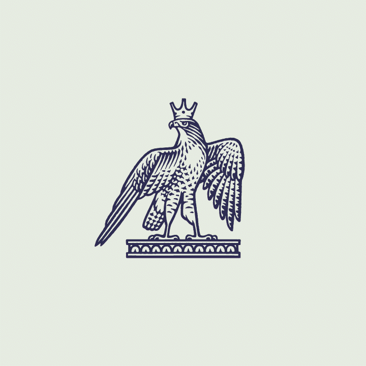
Logo Marks
A series of logo marks were developed to provide Hawkridge with a range of options to choose from when facing unique applications of the Hawkridge visual identity.

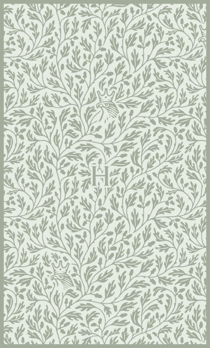
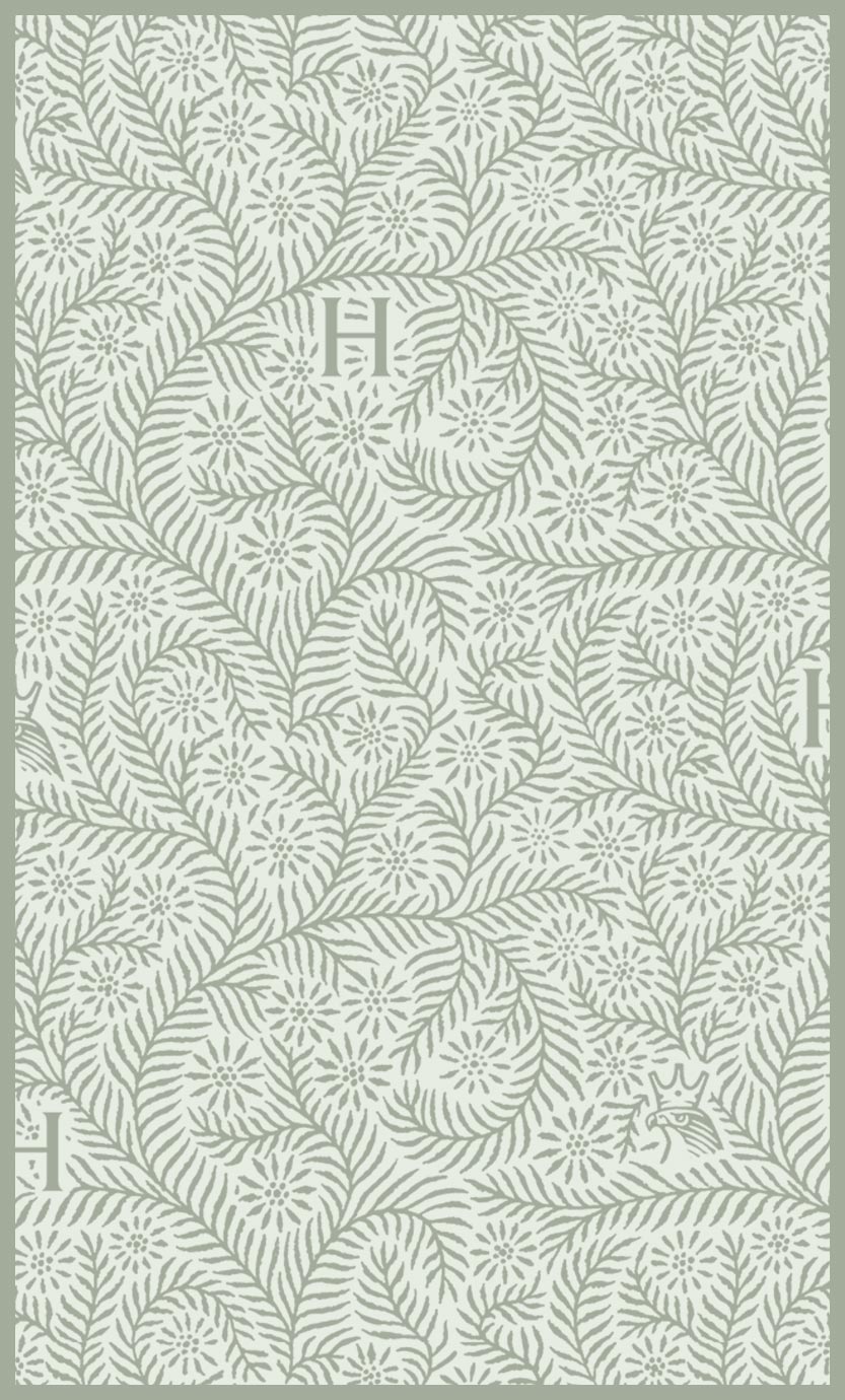
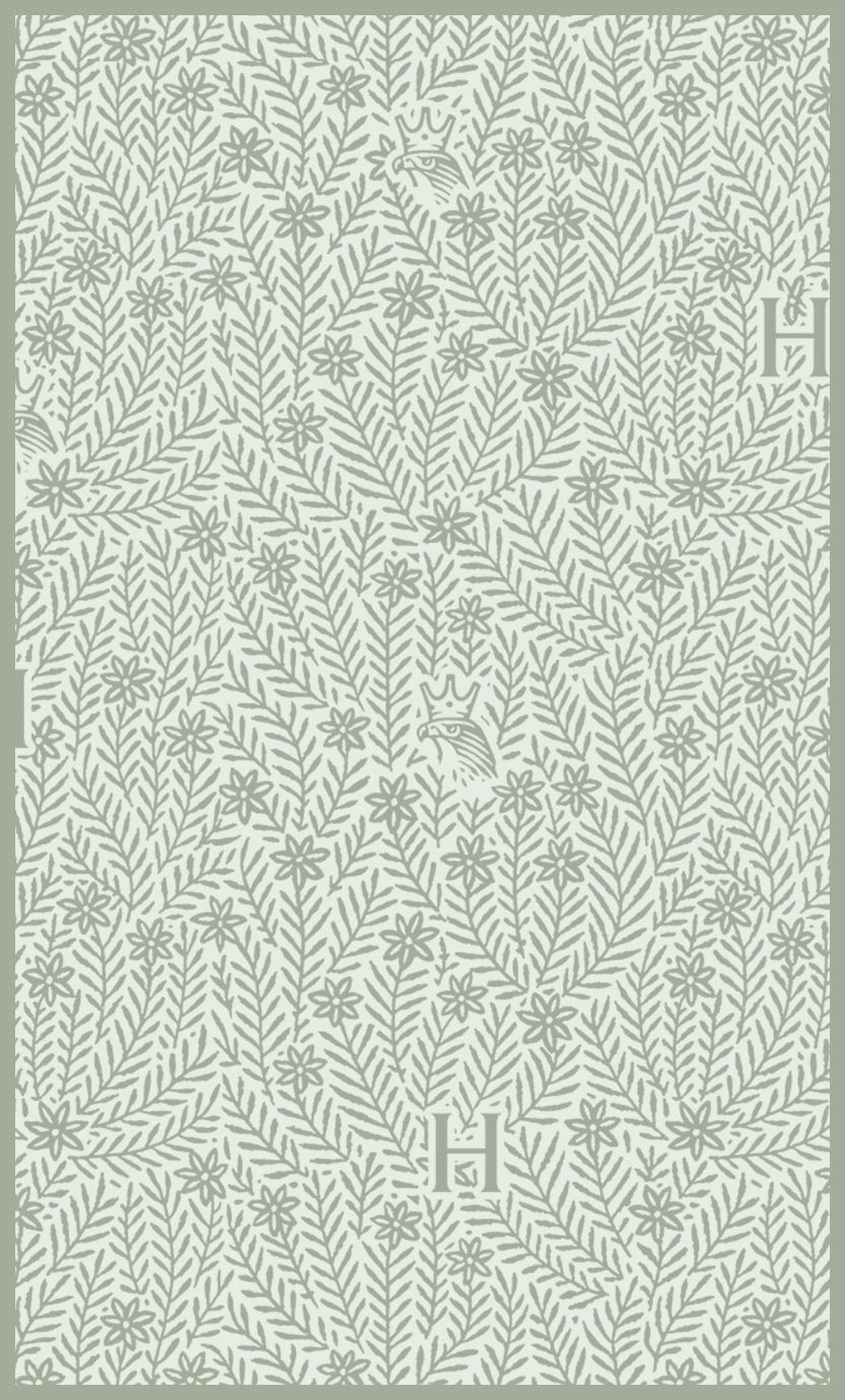
Color & Patterns
Three repeating pattern designs were developed for use on collateral, each featuring elements of local and personal significance to the owners of Hawkridge.
Colors
Brand colors were derived from the natural elements found in the countryside surrounding Hawkridge. These included the red-tailed hawk, lavender, and the atmospheric blues and greens of a distant ridge line.
Brand colors were derived from the natural elements found in the countryside surrounding Hawkridge. These included the red-tailed hawk, lavender, and the atmospheric blues and greens of a distant ridge line.

Thanks again to Tamara and Bob for bringing me in on such a wonderful project.