

Overview
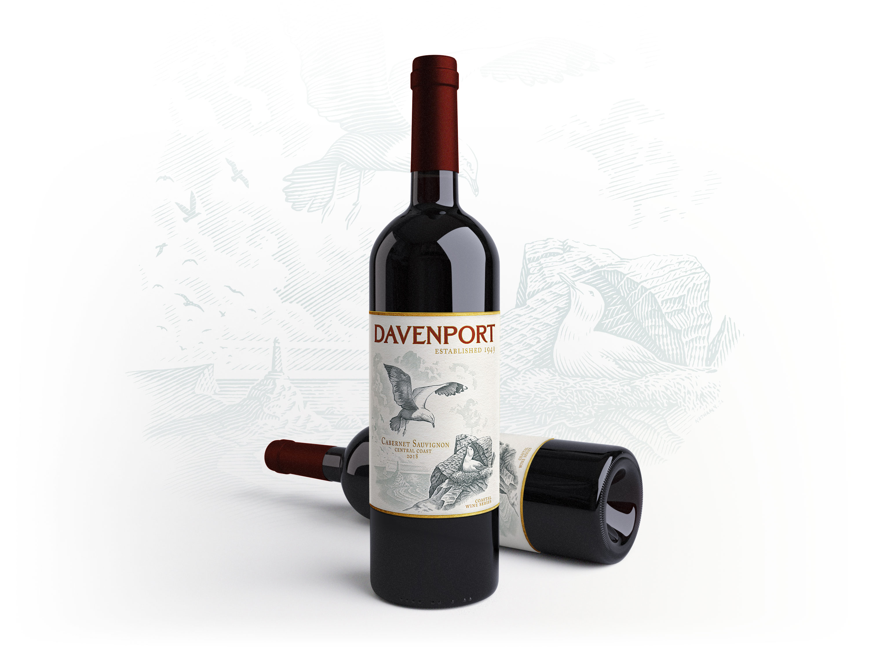
As a self initiated exercise in label design, I developed a fictional brand for which to design a wine label. The concept revolved around a hypothetical “coastal series” of wines which would feature, on each label, a different species of seabird found within the region—in this case, seagulls and the central California coast.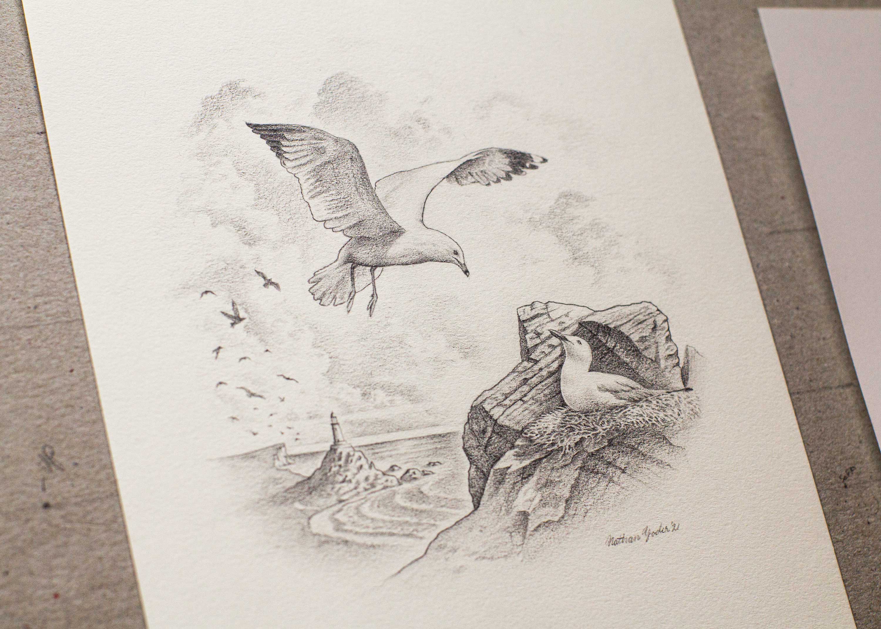
Process
While the end product would be line art, the initial sketch was rendered tonally, using pencil, to allow for a speedier exploration and representation of the subject’s values and textures. Once these preliminaries were established, final art was then produced using pen and ink on a sheet of Bristol board. A dip pen was used due to the variety of line weight and line quality offered by steel nibs as compared to other pens available today.
Color
Once the inked artwork was completed an aquatic blue-green, two color, scheme was applied digitally so as to help better integrate the artwork into the overall label design. Additionally, this two color scheme provided the opportunity to create a greater visual break between the fore and background elements within the illustration.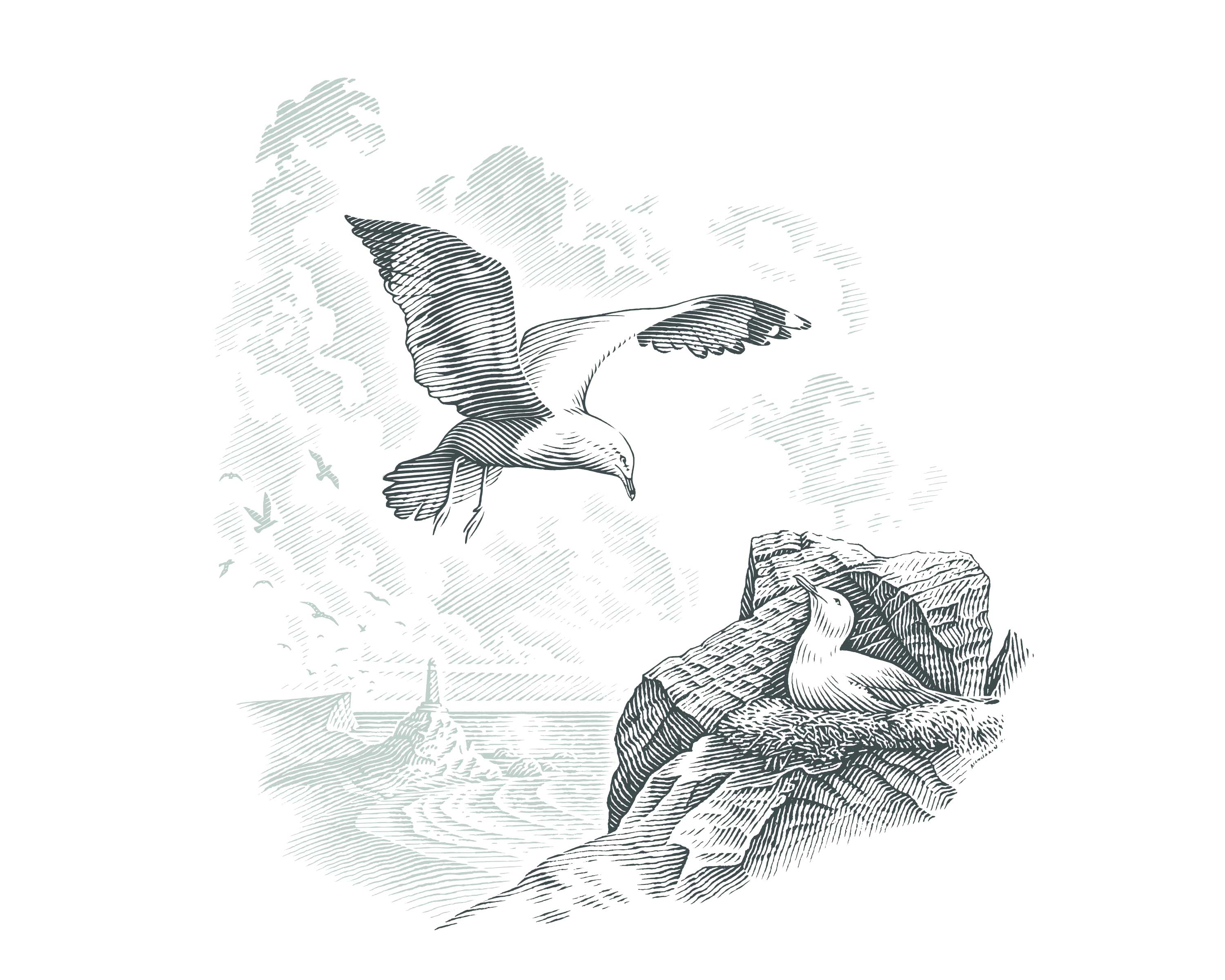

Application
On the label a crimson red was used—complimentary to the blue-green of the illustration—along with gold foil. Gold was used to both speak to the strong perception of sunshine present in the illustration as well as to invoke a greater sense of refinement.Thank you for taking the time to walk with me through this project. If you like what you see, and think I might be able to help you bring a similar project to life, please don’t hesitate to reach out. I would love to hear from you.